The Problem
AI made interface production faster. It also made design drift easier to create.
I kept seeing the same failure in AI-assisted product work. An agent would choose a new font size, spacing value, colour, border, or surface treatment because the design rules were not explicit enough. The code could be correct while the product became less consistent.
I did not need another component library. I needed a way to make my design judgment explicit before an agent wrote the UI.
Decision: Build one tool to explore the system, validate it, and export the same rules to both implementation code and AI agents.
The System
Design Studio started as a Claude Code artifact. I kept using it, so I expanded it into a standalone React product.
The product has five connected workspaces. They share one design-system state, so a choice made early in the process can flow into the final export.
The studio is also styled with its own design tokens. I use the product on itself instead of maintaining one set of rules for the tool and another for the output.
Font Lab
Font choice was one of the first problems I wanted to make less arbitrary. The Font Lab uses Google Design MCP to search live font data by product type, tone, role, and form.
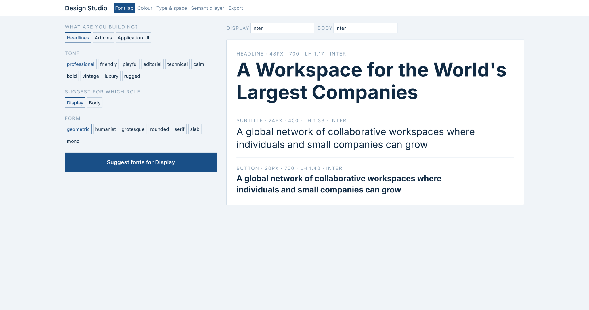
The integration exposed a useful API problem. Google Design MCP unions font categories. It does not intersect them. A request for “professional” and “geometric” can therefore broaden the result instead of narrowing it.
I measured the behavior and built the intersection on the client. The search now queries each axis separately, caches results, retries transient failures, normalizes ranking across broad and narrow categories, and shows near matches when there is no full match.
Colour
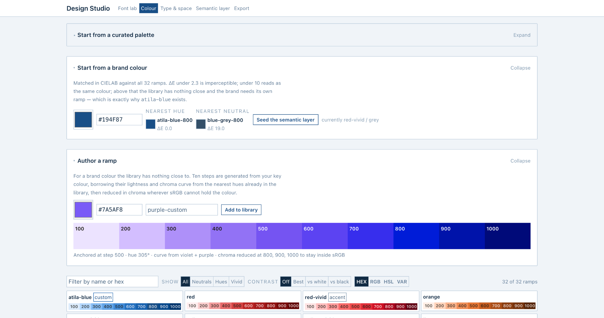
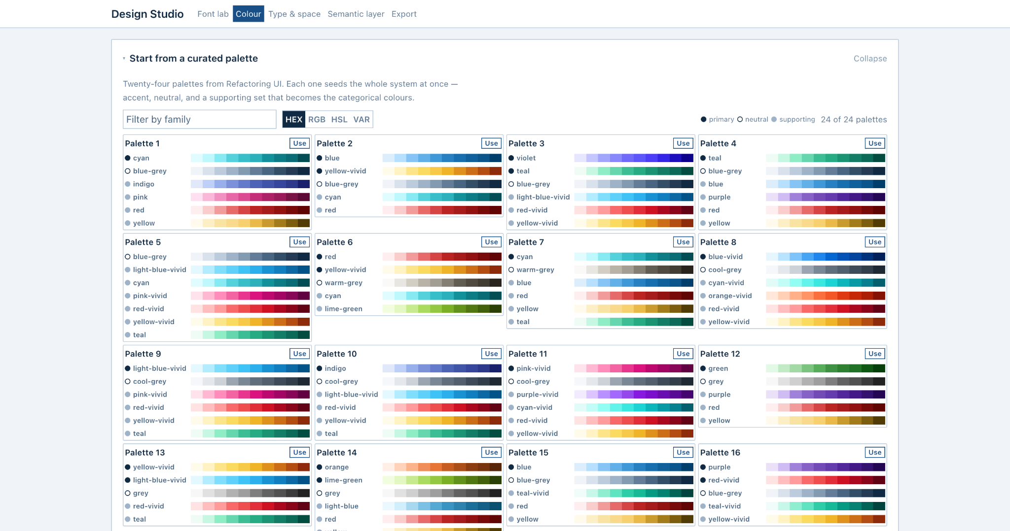
The Colour workspace gives me three ways to start: choose a curated palette, match an existing brand colour to the library, or generate a new ramp when the library has no close match.
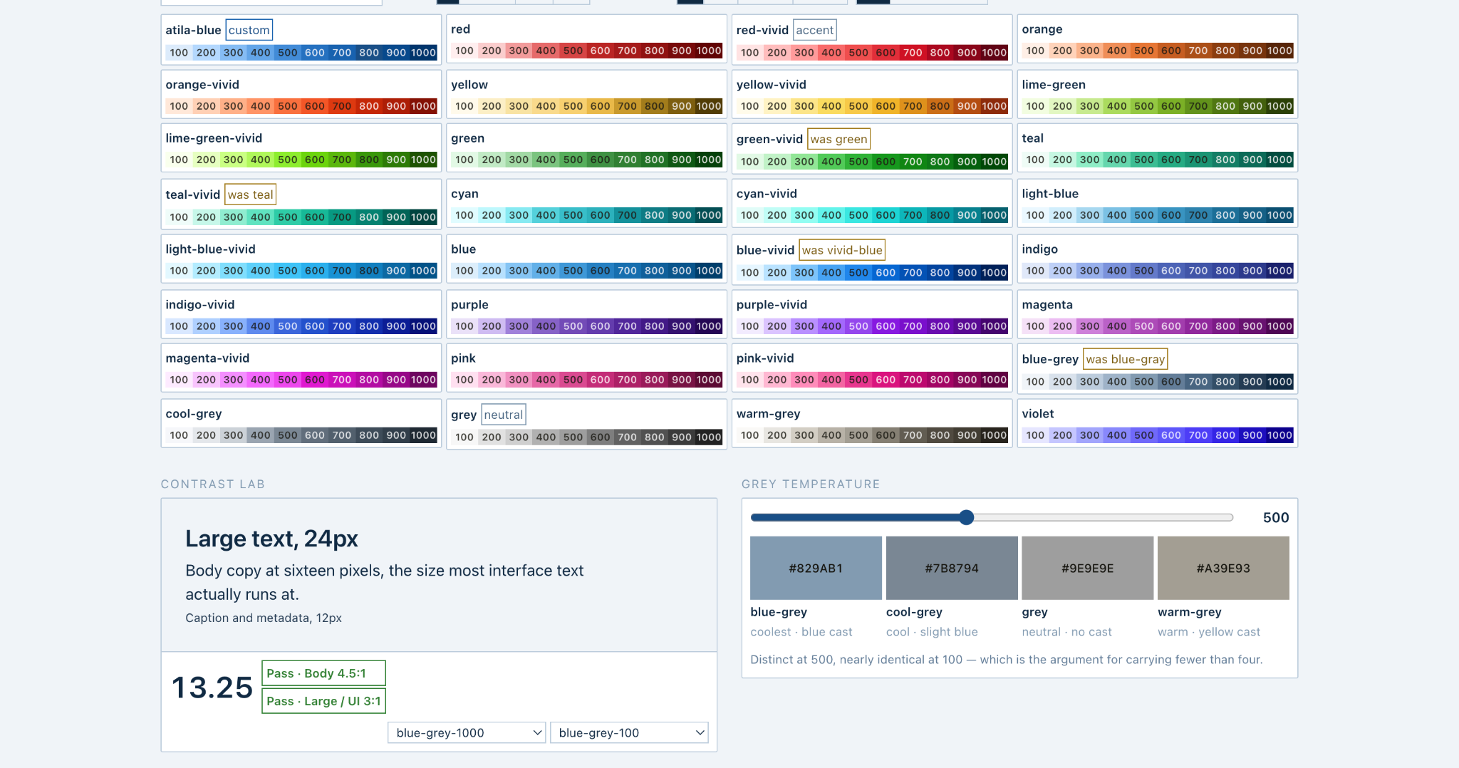
Brand matching uses CIELAB distance to find the nearest colour family. If the difference is too large, the tool can author a new ten-step ramp from the brand colour. The new ramp borrows the lightness and chroma behavior of nearby hues and reduces chroma where sRGB cannot hold the requested colour.
The goal is not to provide more colours. The goal is to reduce arbitrary colour decisions while keeping enough control for a real brand system.
Type & Space
I wanted the same rule for typography and layout: use a defined scale before reaching for a new value.
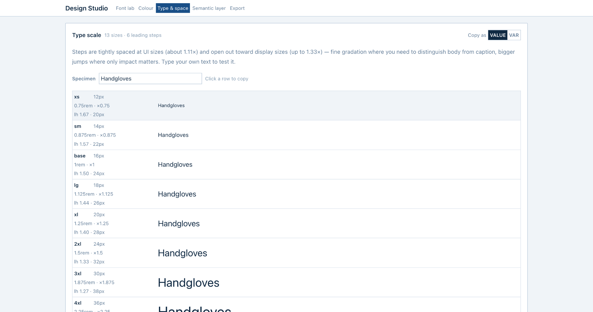
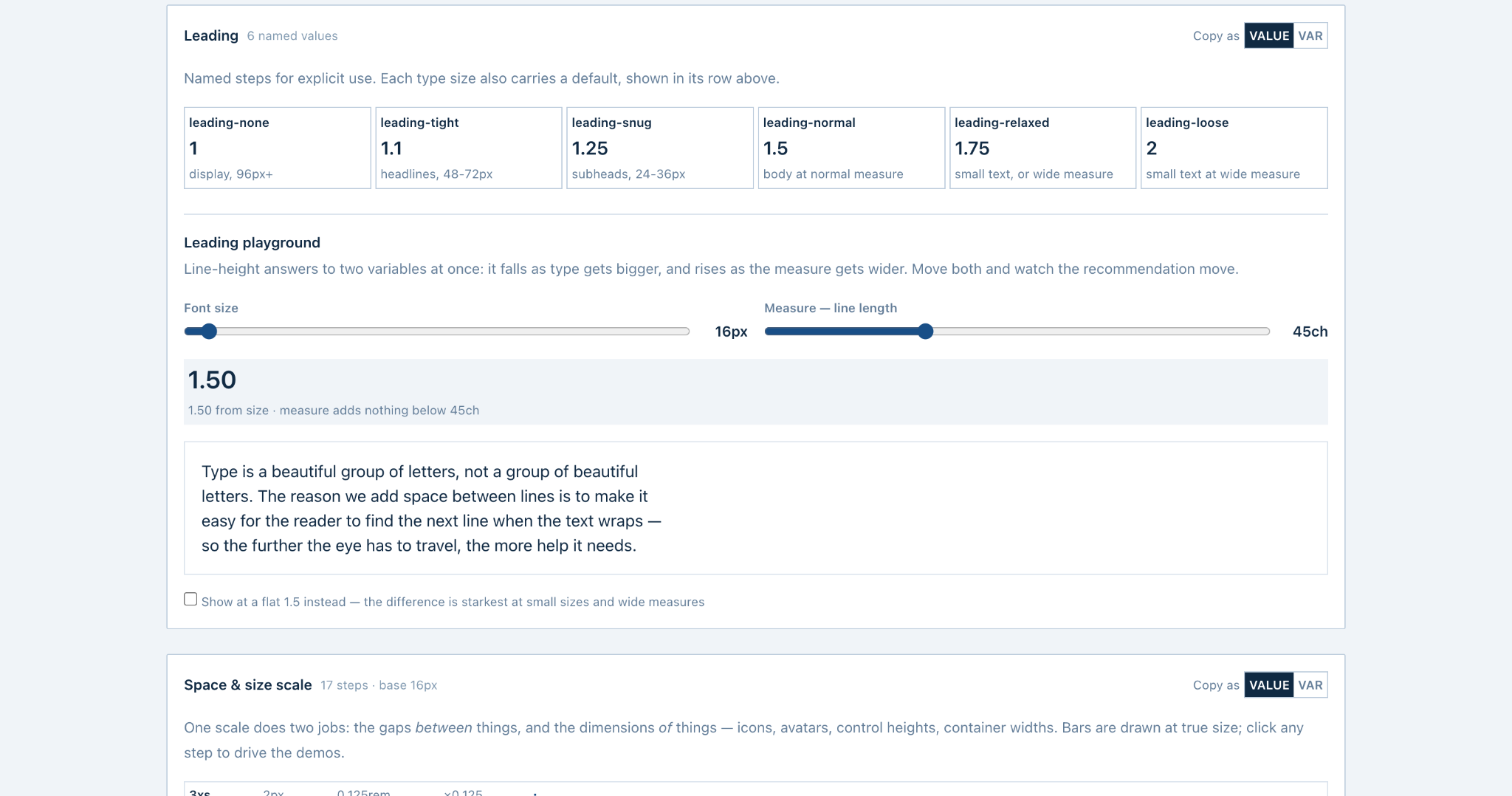
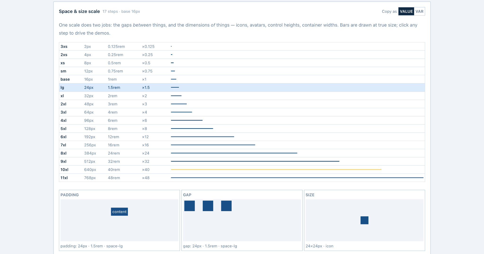
This gives coding agents fewer chances to invent intermediate values. It also makes the handoff more precise: “use space-lg” is clearer than “add a bit more padding.”
Semantic Layer
Primitive colours are useful for exploration, but components should not depend on raw palette values.
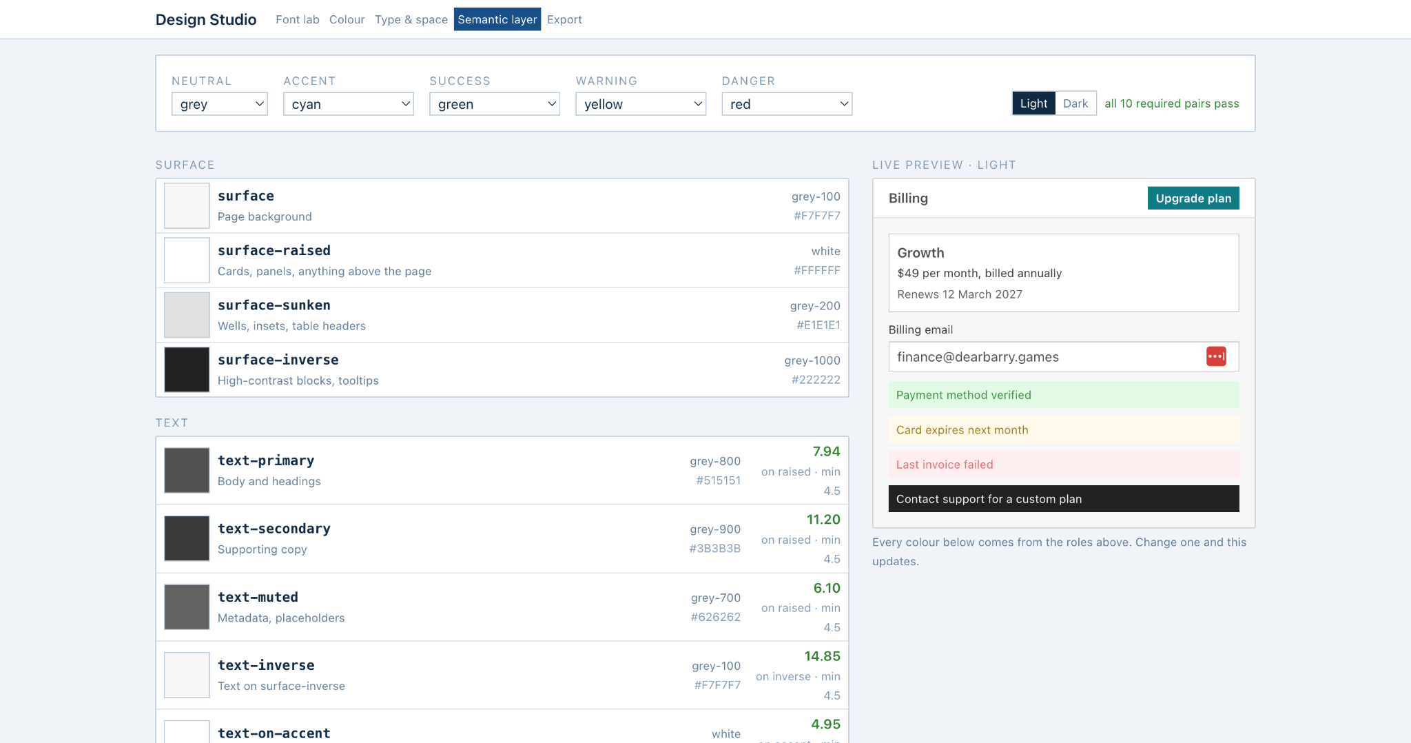
The Semantic Layer maps primitives to roles for surfaces, text, borders, accent states, status colours, and optional categorical colours. It generates light and dark modes from the same role set.
Contrast-aware
Body text targets at least 4.5:1 contrast. UI graphics and focus indicators target at least 3:1.
Mode-aware
Dark mode is generated as a real mode, not as a simple inversion of the light theme.
Role-based
Components reference roles such as surface-raised or text-muted, not a hard-coded ramp step.
Extensible
Supporting colours can become categorical roles for charts, tags, and labels when the product needs them.
Agent Handoff
This is the part that made Design Studio useful in my own AI development workflow.
The studio does not stop after I choose the system. It exports the same decisions in formats for code, design tooling, and AI agents.
CSS variables
Primitive ramps, semantic roles, typography, leading, spacing, and dark mode.
Tailwind
A theme extension that maps the same tokens into utility classes.
Tokens JSON
DTCG-style JSON for token tooling and design handoff.
Agent brief
A readable project specification to give an agent before it writes UI.
Agent skill
A reusable skill with hard rules that can stay inside the project.
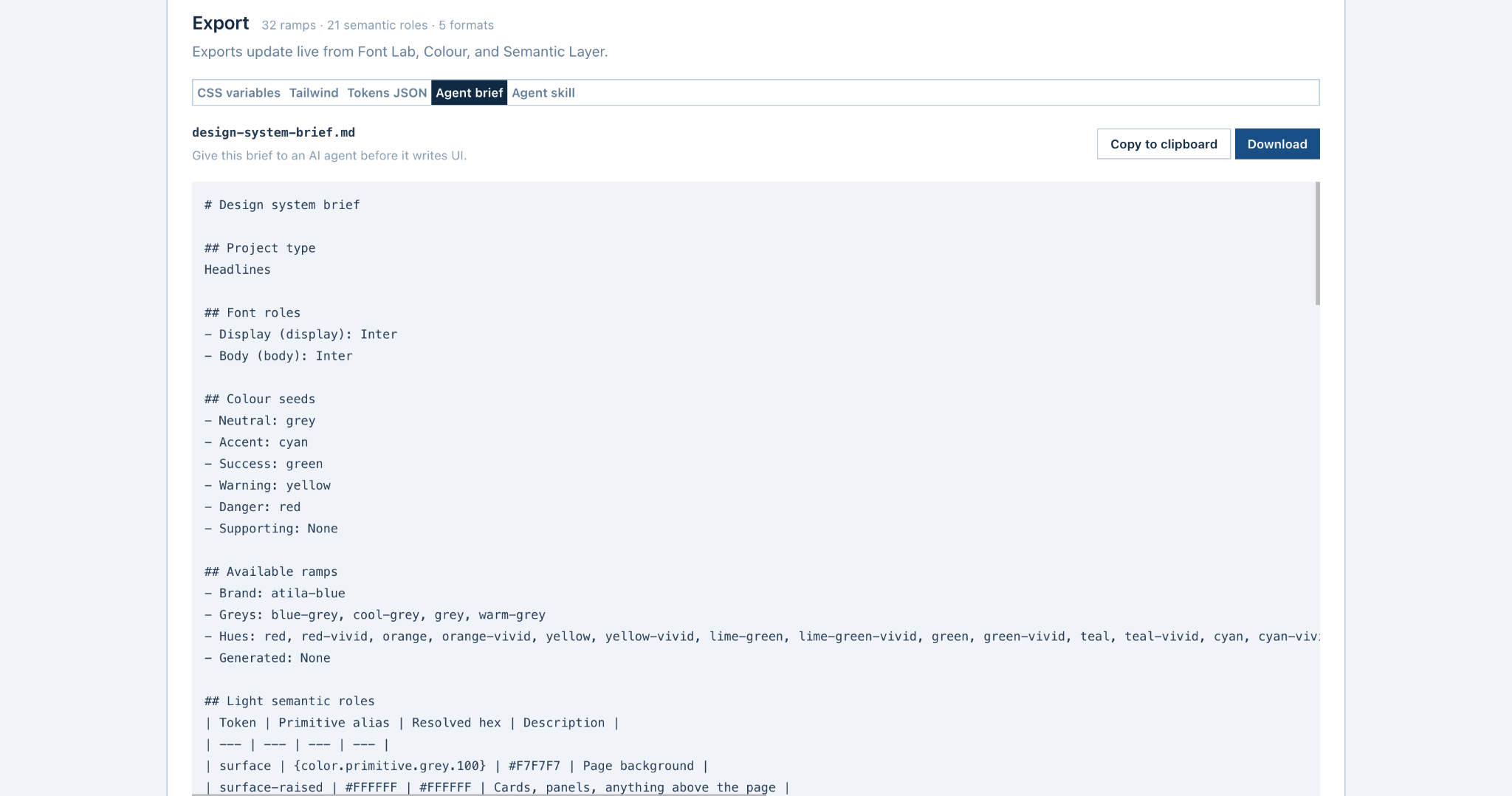
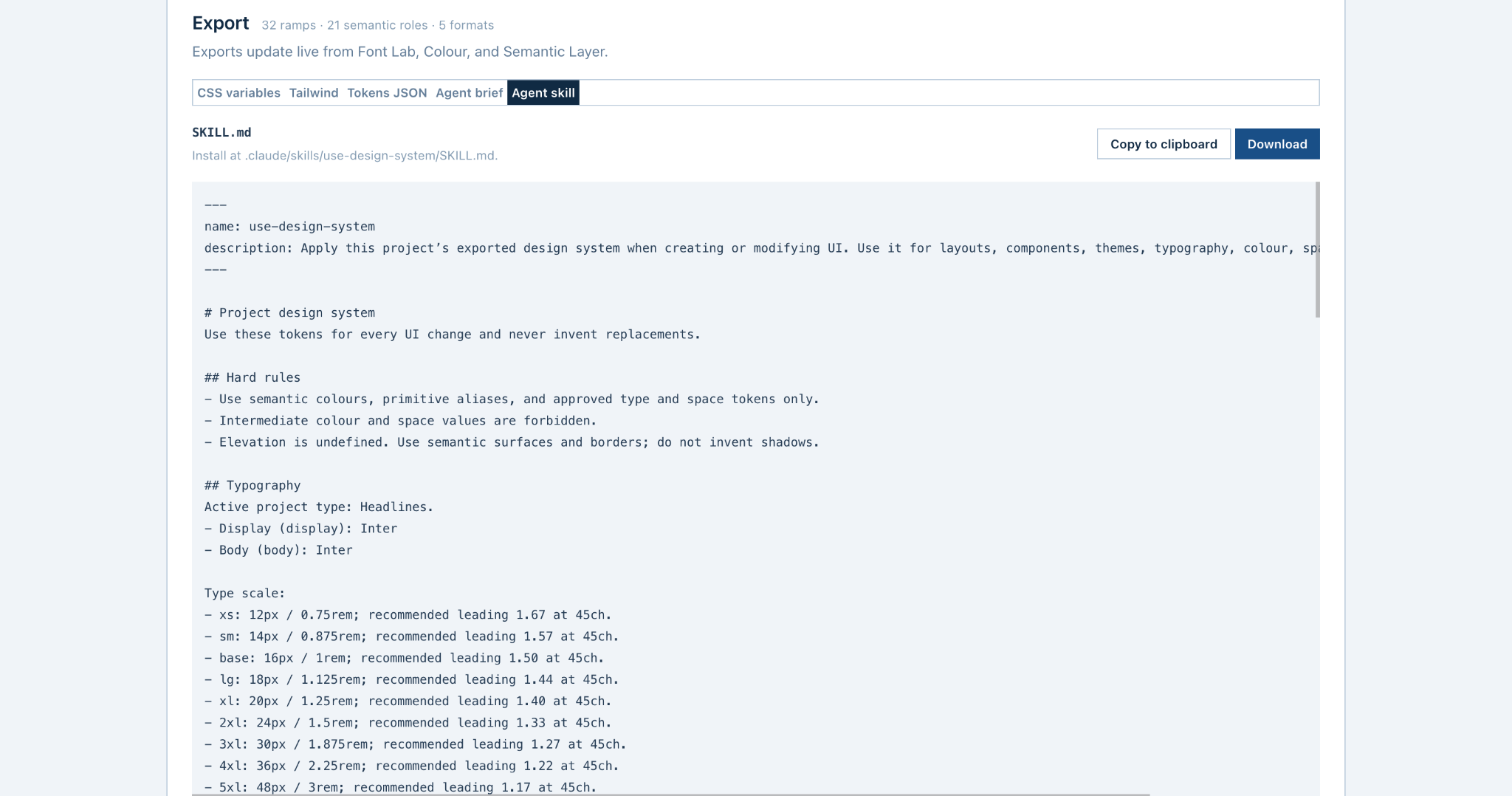
The key idea is simple: the human and the agent should work from the same design system. The tool turns visual judgment into explicit constraints that can survive the handoff to code.
Proof in Use
Design Studio is not only a portfolio concept. I built it because I wanted to use it across my own products.
The portfolio itself became a useful test. The content and information architecture were already in place, but the visual system still felt generic. I applied my existing tokens through Design Studio rather than redesigning every page.
The same structure immediately became more consistent in typography, spacing, surface treatment, and colour. That result reinforced the product thesis: a clear constraint system can improve AI-assisted implementation without requiring a new design every time.
The current version is intentionally practical. I am continuing to improve the product UI, but the core value is already in daily use: define the rules once, then make them portable.
Next Steps
The next phase is less about adding more token categories and more about proving that the system improves AI-assisted development.
Measure agent adherence
Run the same UI task with and without the exported brief or skill. Measure invented values, token violations, accessibility problems, and manual corrections.
Persist project systems
Save named systems so I can reopen, compare, fork, and reuse them across products without rebuilding the setup.
Reduce handoff friction
Move from downloading files to installing or syncing the active design system directly into a project workflow.
Next evaluation question: does giving an AI agent explicit design constraints measurably reduce design drift and rework?